Heart To Help Theme Documentation
Welcome to the official documentation for your Heart to help theme! This guide provides all the essential information you need to set up, customize, and manage your theme effectively. Whether you're a developer or a marketer, you'll find step-by-step instructions and tips to help you create stunning and functional websites.
THEME SETTINGS
The official HubSpot Theme Settings documentation provides a comprehensive guide for configuring theme settings effectively.
CUSTOM MODULE
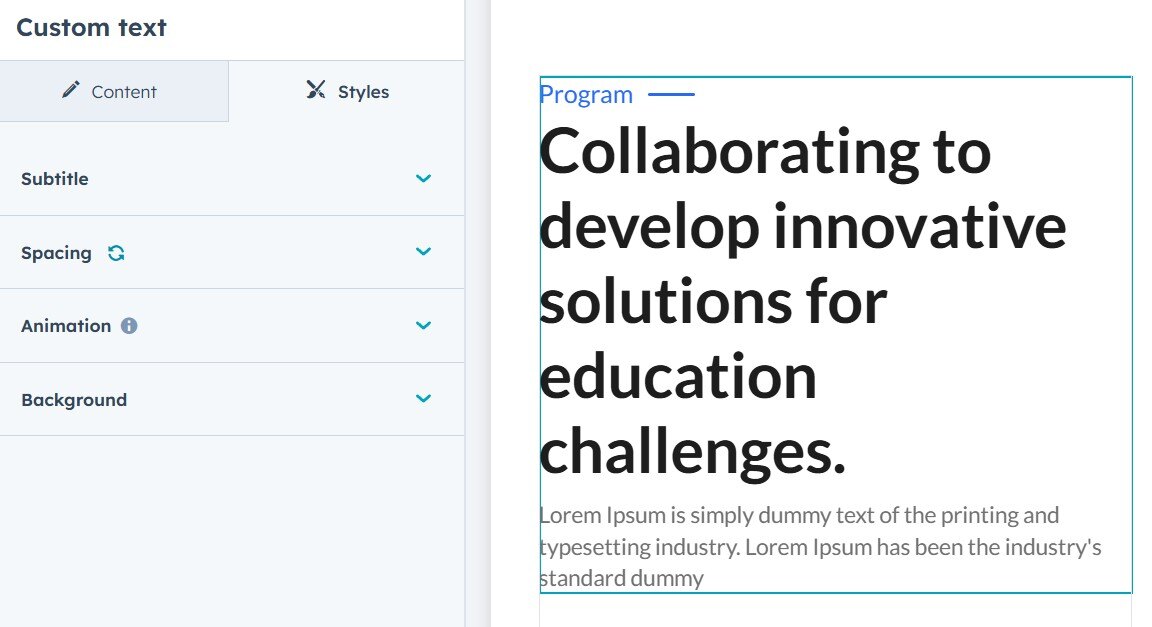
Custom Heading
The Custom Heading module contains two text fields: Sub-title and Rich-text.
In the style settings, you can customize the look and feel of the module by adjusting options such as text alignment, animation, background, and more.
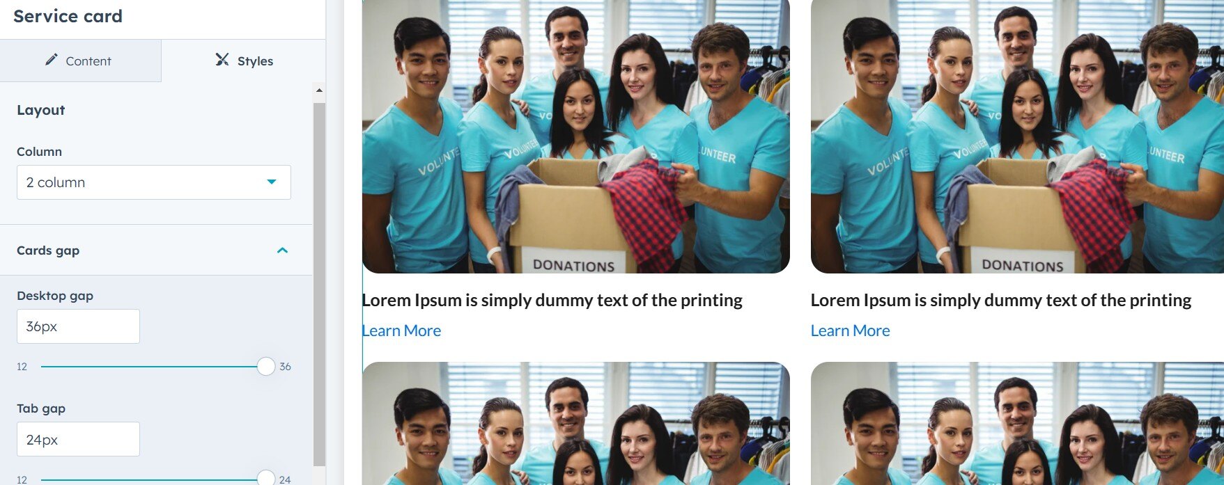
Service card
The Service Card Module is a versatile component designed to display service-related information in an aesthetically pleasing layout. It supports both 2-column and 3-column configurations, along with customizable animations and spacing options to enhance the user experience.
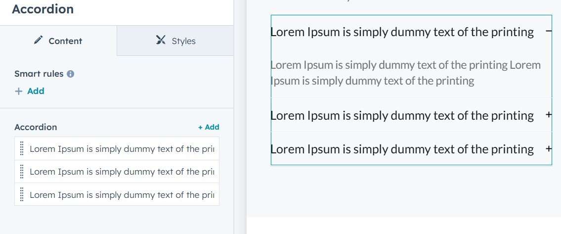
Accordion
The Accordion module is a versatile and customizable UI component designed for organizing content in collapsible sections. It includes features for icon customization, heading updates, and animation toggling.
Icon Changer
- Allows users to set custom icons for open and closed states.
Heading Changer
- Supports multiple heading styles and levels (
<h1>to<h6>).
Animation Toggler
- Enable or disable animations when section reach to viewport
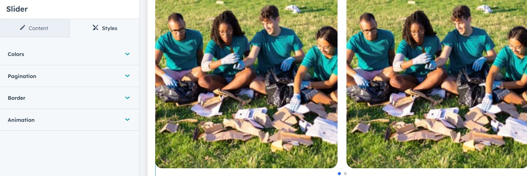
Slider
The slider module provides a dynamic and customizable slider with card-based content. This module allows users to modify the background and text color of each card, set pagination colors, and toggle animation when the section enters the viewport.
-
Card Background Color Editor: Adjust the background color of each card in the slider.
-
Text Color Editor: Customize the text color for better readability and aesthetics.
-
Pagination Color Editor: Modify the color of pagination indicators to match the design theme.
-
Animation Toggler: Enable or disable animations when the slider section enters the viewport.
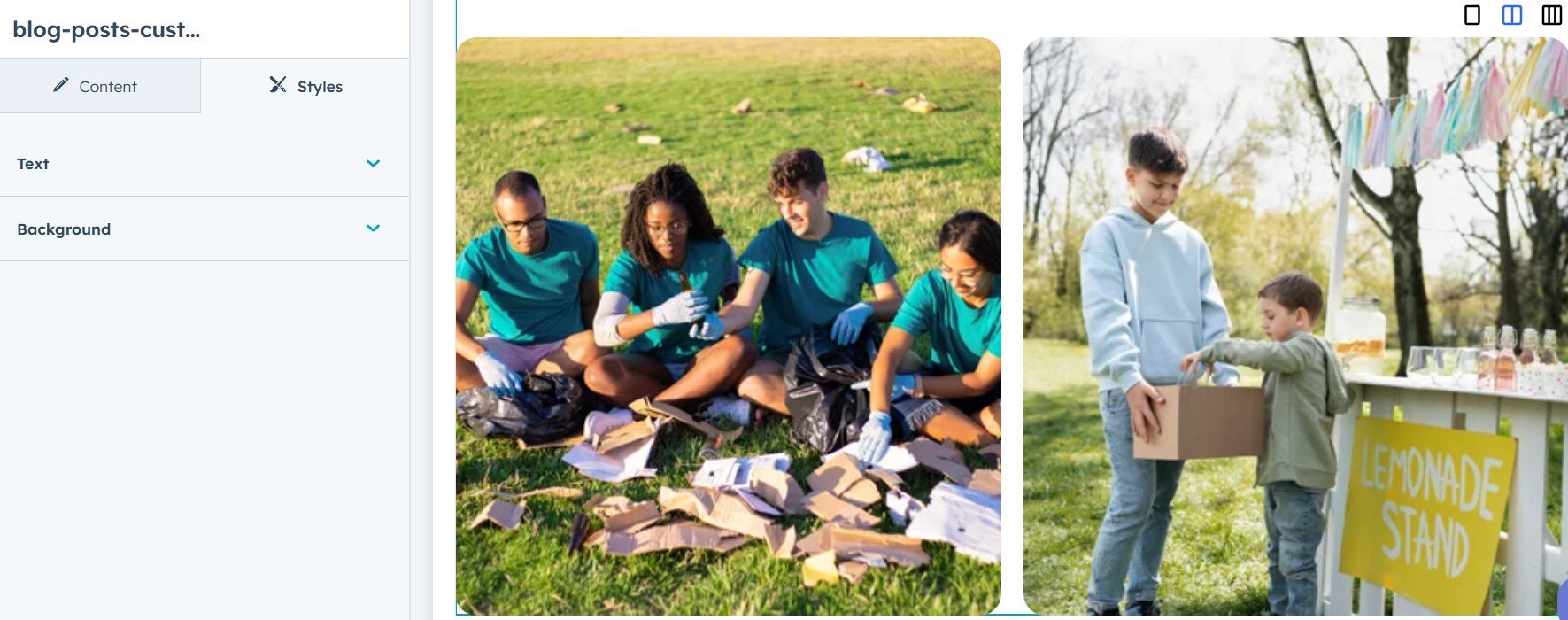
Custom blog post
Don't forget to check out our new custom blog posts module! They feature a 3-column layout switcher, along with options to change text and background styles. Please add Pagination module below Custom blog post module.
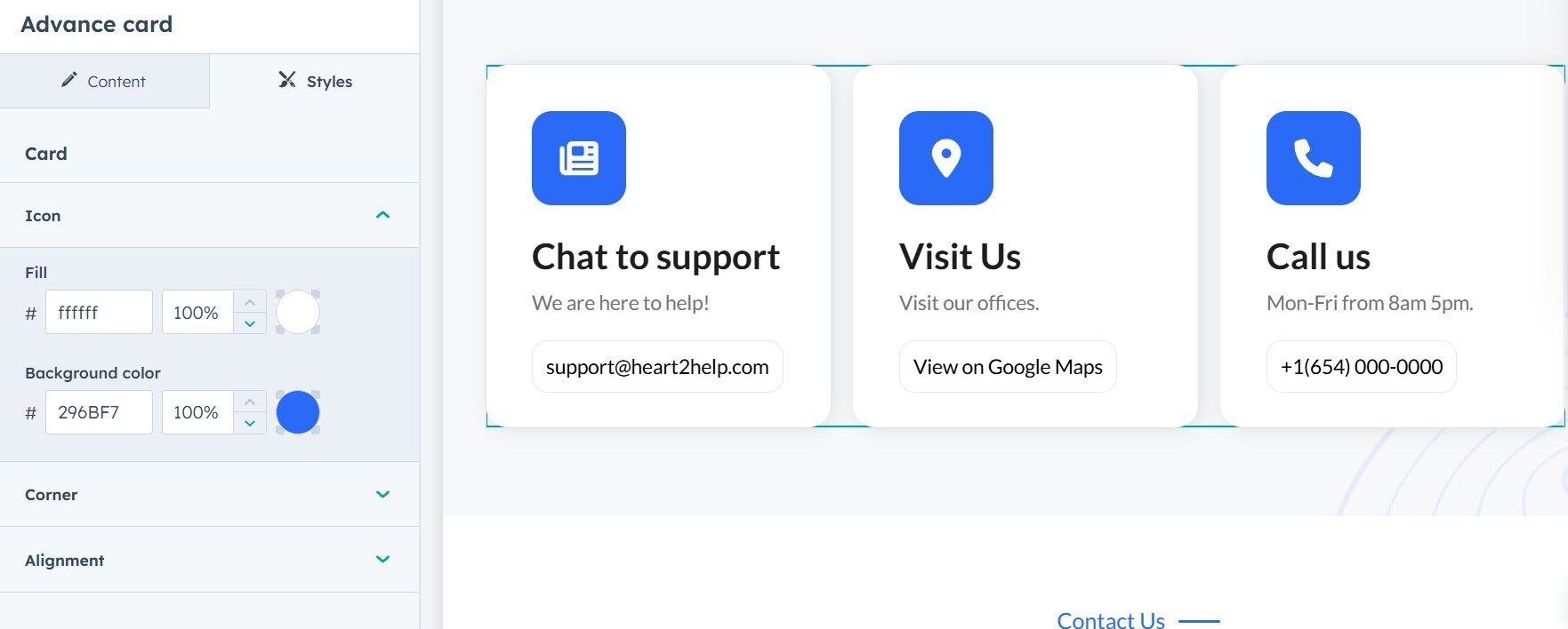
Advance card
The Advanced Card feature allows you to easily customize icons, text color, background color, and alignment. It also includes an animation toggler that activates when the section enters the viewport, enhancing user interaction and experience.
Icon Changer: Easily switch between different icons to personalize your card.
Text Color & Background Color Changer: Customize both text and background colors to fit your theme or preferences.
Alignment Options: Adjust text and content alignment to create the desired layout.
Animation Toggler: Enable animations to trigger when the section enters the viewport for an engaging user experience.

Breadcurmb
The dynamic breadcrumb module generates breadcrumb navigation based on the page's hierarchy or URL. It dynamically updates the breadcrumb links, providing users with easy access to higher-level pages and improving site navigation. You can add background color, text styling and spacing.